Tolk App
TolkApp brought me in to rethink their branding and redesign the UX/UI of their translation app. The goal: make instant communication accessible, intuitive, and effortless for everyone.
Brand Identity, Brand Strategy, UX & UI Designer
TolkApp – Breaking Language Barriers with Clarity and Connection
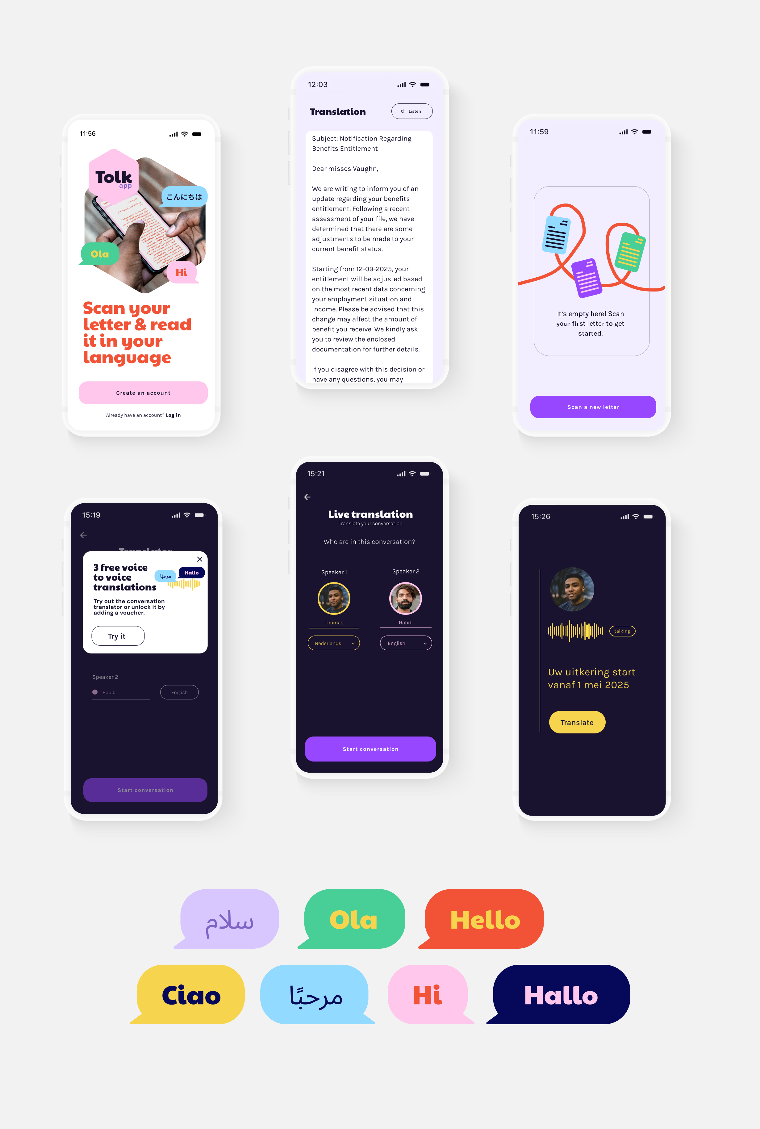
TolkApp is a game-changer in accessible communication. Designed for the 2.5 million non-Dutch speakers and 3 million low-literate individuals in the Netherlands, this app translates and simplifies official documents, making complex language clear and understandable.
It’s a vital tool for municipalities, social workers, and individuals who need instant, accurate translations without the barriers of jargon or incomplete AI translations.
The work
When TolkApp approached me, their mission was clear: create a brand identity and digital experience that felt accessible, human, and empowering, without losing credibility. Together with my partner Beatrice I took on the full branding and design process, ensuring that every touchpoint was intuitive, engaging, and aligned with the app’s purpose.
I worked together with Tolk App on
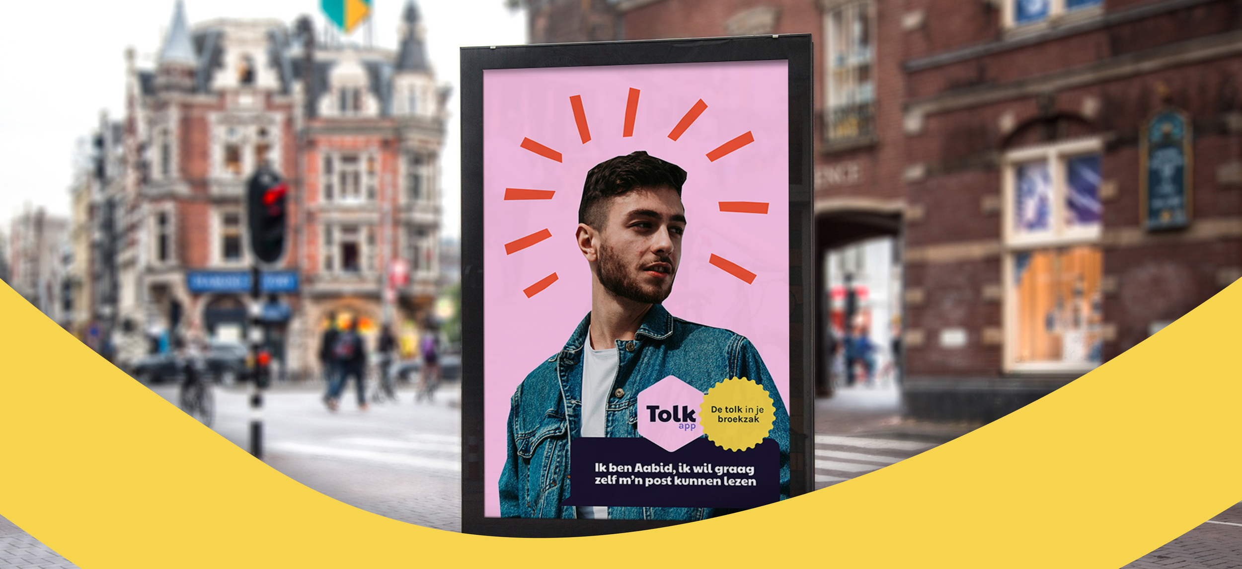
Brand Identity & Logo Design
A bold yet friendly look that reflects trust, clarity, and inclusivity.
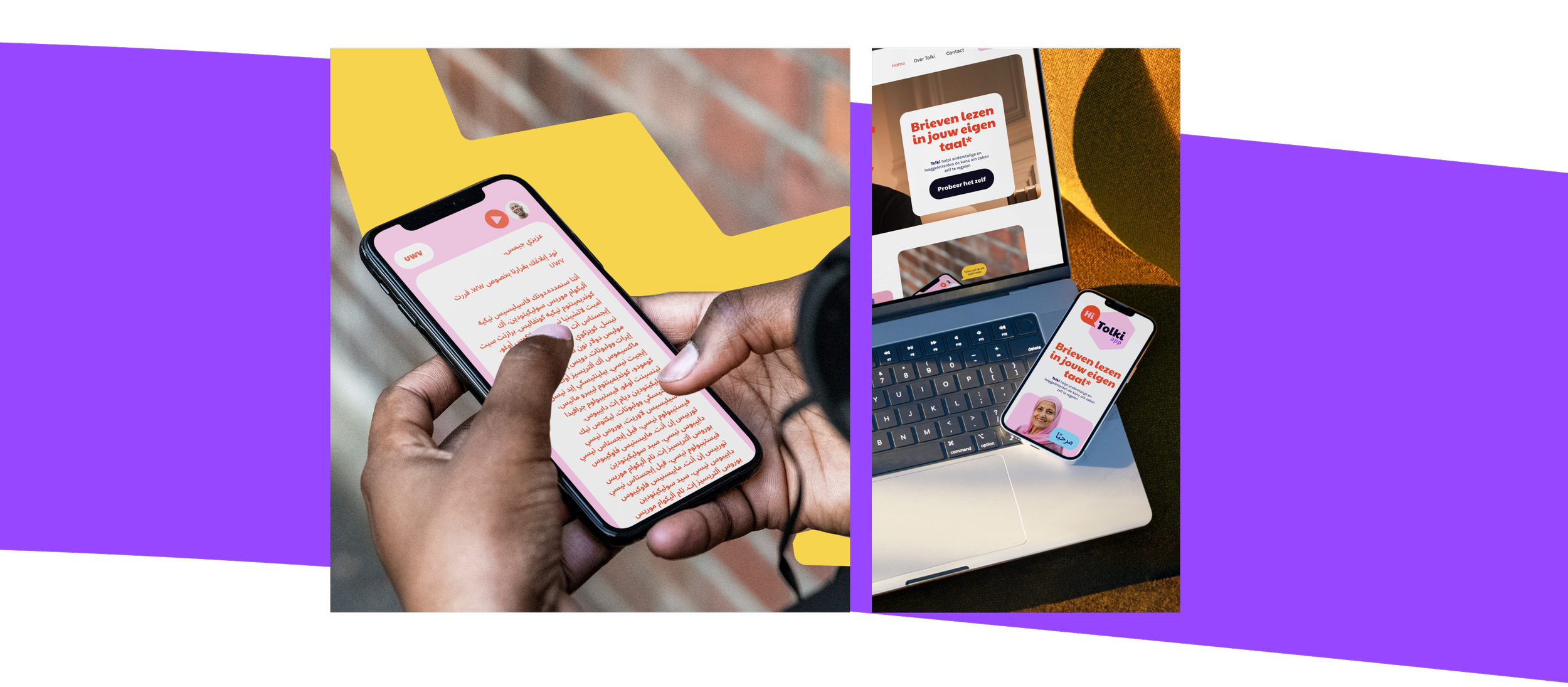
UX/UI for the website & App
A seamless and intuitive experience that mirrors the app’s ease of use, guiding users effortlessly to the right solution.
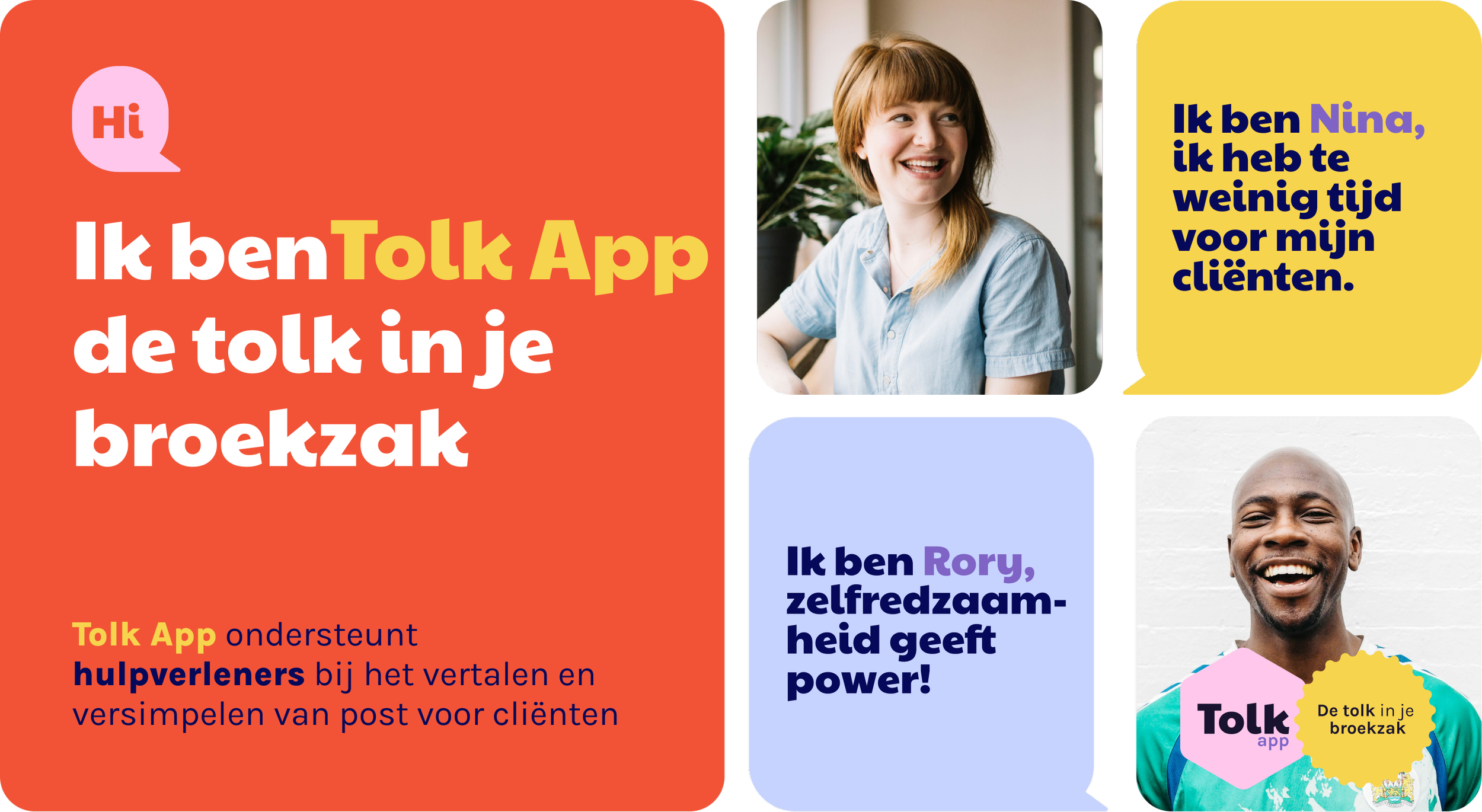
Storytelling & Tone-of-Voice
Crafting an approachable, warm, and solution-oriented voice that speaks to both users and decision-makers.
Visual Identity & Content Strategy
Ensuring consistency across all brand materials, from social media to presentations and app interfaces.
